Major site visual update!
Posted on: 2026-04-16T22:04:00.000Z
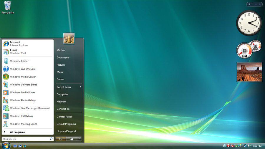
Hot take, but I didn't think Windows Vista was bad
Hello, Aero!
Looking good, if I do say so myself. Plenty of work to be done of course, but for once, let's focus on what has been done.
Windows Vista theme!
I said I'd do it, and for the most part, I did!
There isn't quite as much "glass" as I'd like, and the UI isn't a perfect recreation, but there's definitely transparency, gradients and such.
Quite a lot of code was used to make it happen, and more than a bit of searching because, as mentioned in the previous blog, Windows Vista just didn't have the UI resources that XP did.
The Back and Forward buttons in the Explorer, for instance, took quite a bit of digging and upscaling.
I wanted to use 7.css, which is FAR more authentic to Vista / 7, but not even that has said navigation buttons on it. Something to look out for in the future, if the creators of that ever figure it out themselves.
It won't be easy, cause I kept a lot of the old code because
Dark / Light modes!
I didn't want to get rid of the XP theme, after all the work I put in it.
So I kept it as is.
There's now a toggle in the Start Menu (which now has content) that will switch between Light (XP) and Dark (Vista) themes.
Site Map
I'm not sure if that's the proper term for it, but speaking of the Start Menu, the intention was that it would be available for use for navigation if the user's screen is too small.
And in some smaller screens, the Start Menu doesn't even appear!
So, enter the Site Map. It's just a page with links to other pages. Nothing more.
I know, I know, I said I wouldn't make this website mobile-friendly.
But more content is better than less, right?
Other small stuff (that hopefully, adds up)
-
The Home page has been revamped! Gone (for now) is the marquee text. I'll put it back somewhere appropriate. My logo also now changes depending on the time of day of the user; it's a bit more yellow (AKA, Sunrise) during the day, and a bit more orange during the night (Sunset)
-
The Blog page now also modifies the Title Bar / Breadcrumb Bar (for XP and Vista respectively) to add the title of the very blog the user opened. As well, the side bar now just lists the latest four blog posts. No need to see the earlier ones after all. No siree.
-
My Neighbors page now has actual Neighbors! I'll still need to sort them out by, idk, I guess category of my interests, but hey, I have two followers! That's nice!
-
The About page now has an updated Credits section, which details all the resources I referred to when making the Windows Vista theme. And an updated tale of how I got into Tron, in the About Who section.
What's next?
I suppose the big one is a game of sorts, or some sort of interactivity. The changing logo is a nice step in that direction, but I could always use a little more.
More UI polishes of course. Keeping a close eye on 7.css for that.
I'm also interested in creating an Art / Meme page, and a Projects page, just because I don't think they count as "blogs", but I don't really have much to show off in either category. Yet.
That's a lot as it is. Compounded by the fact that I am, unfortunately, unemployed, and scrambling to find a job in this terrible, terrible, economy, thanks to a certain Orange Idiot.
But we will get there.
"One slow step at a time."
- Lance